Get 10$ Digital Ocean SSD Hosting Credit for free.

How to set up live reloading Unit Tests with jQuery, QUnit and Grunt

Introduction

Frontend JavaScript developers today have a great choice of tools available, that enable a more productive workflow. I currently facilitate Grunt, Bower and Yeoman, which are great build tools that emerged around the NodeJS community. I also use RequireJS for modularization and QUnit for unit testing.

I am always very hesitant in introducing new tools into my workflow, because there is often that period where you do not feel productive and the new tool is more in the way than helping. Very often though I can not imagine living without out that new tool after a while.

To help others to get their JS development faster to a more professional level I decided to write some quick tutorials covering one specific use case at a time, that I found useful for myself when working with the above mentioned tools. It will probably be geared mainly towards the intermediate and advanced JS developer, so total basics will not be covered.

Tutorial

This first post guides you to set up an example project with live reloading unit tests using Grunt and QUnit.

QUnit is the unit testing framework coming from the jQuery community.

Grunt is a task runner, that enables the automation of repetitive tasks.

Prerequisites

1. Download and Install NodeJS

NOTE: You do not need to use NodeJS for your project, but we will need NPM (The NodeJS package manager) to install and run Grunt.

2. Get the latest jquery.js

3. Get the latest qunit.js and qunit.css

OPTIONAL: If you are lazy you can just clone the project from a GitHub Repository I created for this tutorial:

git clone https://github.com/Sturmination/livereload_qunit_tut.git

Project Structure

/lib/jquery.js 
/lib/qunit.js
/css/qunit.css

/src/tests.js 
Gruntfile.js
package.json
index.html

File Contents

index.html

<!DOCTYPE html>
<html>
	<head>
		<title>Live Reloading Unit Test are awesome</title>
		<!-- Style -->
		<link href="css/qunit.css" rel="stylesheet" type="text/css" />
	</head>
	<body>
		<!-- Mark Up required by QUnit -->
		<div id="qunit"></div>
  		<div id="qunit-fixture"></div>

  		<!-- Libs -->
		<script src="lib/jquery.js" type=></script>
		<script src="lib/qunit.js"></script>
		<!-- Src -->
		<script src="src/tests.js"></script>
		<!-- LiveReload script served by Grunt -->
		<script src="http://localhost:35729/livereload.js"></script>

	</body>
</html>

The livereload.js is served by a localhost server. This is a NodeJS server opened by grunt later.

src/tests.js

test("This is just a test",function(){
	ok(true, "True is actually true!");
});

Just a very simple QUnit test. For further information see offical QUnit documentation.

Gruntfile.js

//Gruntfile
module.exports = function(grunt) {
  //Initializing the configuration object
  grunt.initConfig({
    watch: {
      // Folders and files that are being watched by grunt
      // Add your additonal project files and folders here!
      files: ["src/**/*.js", "index.html"],
      options: {
        livereload: true
      }
    }
  });

  // Plugin loading
  grunt.loadNpmTasks('grunt-contrib-watch');

  // Set watch as the default task
  grunt.registerTask('default', ['watch']);
};

This is the config file, which tells Grunt what to do. Remember adding your specific project folders and files to the watch task.

package.json

{
  "name": "livereload_tdd_tut",
  "version": "1.0.0",
  "description": "Example project on livereloading unit tests",
  "author": "Sebastian Metzger",
  "devDependencies": {
    "grunt": "~0.4.5",
    "grunt-contrib-watch": "~0.6.1"
  }
}

This file is required to tell NPM what dependencies to resolve for your project. We only need grunt and the grunt-contrib-watch task for this example.

Install Packages and Run Grunt

After you have set up your project directory, open a console and switch to that directory.
If you installed NodeJS correctly the following command should install the dependencies specified in the “package.json”

npm install

Now you can see NPM installing grunt in your project!

Next start grunt with the simple command

grunt

We configured in the “Gruntfile.js” the “watch” task as default, so no parameters are required.

If everything went right, the console now should say:

Watching...

This means the watch task is active! Grunt is monitoring your project folder for changes and has opened the NodeJS instance that serves the “livereload.js” file.

Finally open the index.html in the browser of your choice.
You should now see the QUnit interface and the single test successfully executed.

QUnit tests successful

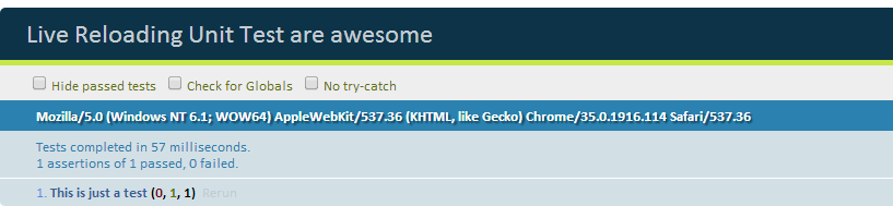
QUnit tests successful!

The “http://localhost:35729/livereload.js” included into your “index.html” should now have established a web socket connection to the server opened by the grunt watch task, which will trigger a page refresh, whenever the watch task detects a file change.
To test this just change anything in the “index.html” or “src/tests.js” and press the save button.

For example extend the “src/tests.js” with another test like this:

test("This is just a test",function(){
	ok(true, "True is actually true!");
});

test("This is just another test",function(){
	ok(true, "True is actually true!");
});

The browser window with the QUnit tests should now reload automatically after you save the file changes.
Isn’t this exciting? I think so! 🙂

Why is this useful?

Now you can basically put the browser with the unit tests on your second monitor and just hack away in your favorite IDE until you see something break in you peripheral vision. You do not have to break your coding workflow constantly to refresh the browser or click around in the user interface.

You can also open the tests in different browsers simultaneously, which all will reload after every change you make. This is very cool because you are constantly aware of cross browser compatibility and see a divergence exactly in the moment you wrote the line of code, that caused the faulty behavior.

I found this a useful workflow when working on a lower level library that does not directly affect any HTML/CSS or user interaction and thus can be better developed against unit tests from the start.

If anything is not working or you think I should go more or less into details in the next posts, please feel free and leave a comment. I also take requests for further tutorial posts. 🙂

Get 10$ Digital Ocean SSD Hosting Credit for free.

User Experience Review of Qatar Airways Onboard Entertainment System

Introduction

TLDR: Spend too much time with onboard entertainment system during long flight

A couple of days ago I came home from a three week backpacking trip to Thailand with a couple of friends.


thai beach

We flew from Munich to Bangkok with Qatar Airways via Doha Airport. As for me (and probably most of you) the thing to look forward on a long international flight is to watch some cool movies to get over the drudgery of being in a confined space for such a long time.

That being said, as a software developer currently mainly focused on front-end, I could not resist to analyze and think about the user interface and experience of Qatar’s entertainment system ‘Oryx’ for quite some time (before I decided to watch the movie “Thor”, which shamelessly reminded me to hit the gym a little more often …)

Additionally I want to say that I was 100% satisfied with the service of the airline and it was also probably the most modern entertainment system I encountered on a flight as of yet with a great collection of movies.

But here are some points that annoyed me or struck me as a little weird.

User Experience Review

1. Useless Animations

TLDR: Don’t be fancy for the sake of being fancy.

Just because it looks fancy in the presentation to the managers, does not mean it is a great experience for the customers.
Fanciness should always be used with a clear intent and reason. For example to get the users attention or to illustrate what action just happened.

When I scroll through the available movies (see youtube video above) I want to get a quick glimpse on the available repertoire, not watch the movie thumbnails appear one by one with a fancy animation. There were a couple of other examples of time consuming “stuff appearing slowly” animations when clicking through the UI.

2. Unusual Home and Back Button Behavior

TLDR: Don’t mess with well established UX patterns.

The Home button should bring the user back to the initial screen. This helps the user to have a fixed start location, from where he can remember the path to find certain things. Touching the home button, Oryx showed some kind of drop down menu with a slightly different structure than the main menu. This is what menu buttons are for!

The Back Button should bring you to the previous screen. They basically tried to make this work, but a lot of screens seemed not be added to the history stack, which resulted in jumps back to the main menu quite often, when you were already a few pages in.

Don’t try to be smart with UX patterns everyone is already very familiar with and invest some time in proper history management.

3. Slow Touch Screen

TLDR: Don’t annoy users with slow reaction time.

Something that is most likely not just a software UX issue: The touch screen delay was easily over 1000ms. The average user already gets pissed at 200-300ms wait times.

This problem might get solved with the next hardware upgrades though. Quality touch screens are cheaper than ever today and should increase user engagement immensely.

Especially for the onboard shopping section of the infotainment system I believe this higher engagement could result in direct $$$ for the airline. (Imagine the difference in sales for an e-commerce website like amazon if every user interaction would take 1000ms+)

4. Obsolete Channel Number System

TLDR: Be brave and throw away old concepts.

Another thing that struck me as weird was the functionality to directly access a movie via a four digit number code.

I mean I get it, the numbers are in the printed magazine and you can then directly jump to the desired item, but with a fully functional touch screen, who needs this printed out version of the movie library anymore anyway?

I estimate only a very small percentage of passengers is using this feature anymore. The confusion this unnecessary complexity creates for other users probably outweighs the benefits of supporting this old pattern.

Additional material

Here are two “professional” screen captures I made as an illustration.

Screen capture B777

Screen capture B788

Get 10$ Digital Ocean SSD Hosting Credit for free.

Brain Hemispheres and Software for Knowledge Workers

I currently read The Master and His Emissary by Iain McGilchrist.
So far very interesting read, even though I am only 10% in.

It basically deals with the dichotomy between the left and right brain hemispheres and the latest findings and implications in this area.
Very briefly summarized the right hemisphere is mainly responsible for looking at the “big picture” and the “whole situation”, where as the left hemisphere tries to divide everything into its details and abstraction layers.

Even though a healthy human should be able to do both of these things very well, I can probably categorize most of the people I know into tending into being more of a right or left hemisphere user.

As a software developer and information systems graduate I spent a lot time thinking about productivity software for knowledge workers. Knowledge workers work primarily using their (Suprise!) brain.

There are tons of different tools out there, with diverse approaches. Generic solutions like Microsoft Office, Google Docs or Evernote.
Project Management and Collaboration Tools, like Basecamp, Asana or Trello.
About a gazillion to-do list apps for smartphones and many more.
You get the picture!

Thinking about it in context of brain hemispheres I can probably see, why there never will be a solution fit for everyone.

I know people who like to categorize, order and tag everything they do meticulously. (Probably leaning more towards the left hemisphere thinker).
Then there is the other category of people, that probably tend a bit to the right side of the brain, that organize everything in very broad and generic buckets without being to detail driven.
I would count myself into the latter group. Looking at my Gmail account, I never use labels, I have tons of unread messages and I really like if something is categorized and filtered for me, so I don’t have to deal with it myself.

I can see that some tools like Evernote for example embrace both kinds of people on a certain level. You can use it as a sloppy Note collection or tag and order everything in great detail.

Perhaps thinking about how the brain works first, can yield in creating more awesome software supporting knowledge workers?
Will probably explore these unfinished thoughts more in a “part II”, when I am further into the book.